4 min
4 min
How to Keep Your Typography Clean

Do you give typography the attention it deserves? It encompasses the details that make a text consistent and readable. Neat typography reinforces the credibility of your writing. Antidote also devotes a whole language guide to it, the contents of which are perfectly integrated into the corrector. Here’s how to effortlessly master the subtleties of typography using Antidote.
Note — In this article, we provide several links to the Antidote Web guides, marked with the symbol. To find the same articles on the Antidote software, type the subject in the language guide search field.
What is Typography?
Typography is the art of arranging the elements of a text to be displayed in a printed or digital document. Yes, an art! This explains the fact that there are no hard-and-fast rules governing typographical standards. In fact, when the expression typographical standards is used, it must be understood in the sense of “generally accepted principles”. Although practices vary, there is still consensus around the objectives that neat typography should aim for: consistency and readability. For example, typographical standards dictate the use of spacing , italic text and the layout of dates and times .
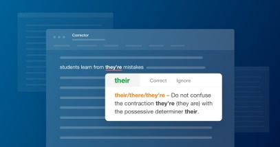
What is the difference between typography and punctuation?
Typography and punctuation always work together in a text but play distinct roles. Punctuation is a set of symbols : the period, the question mark, exclamation, comma, colon, semicolon, asterisk, etc. It is used to mark the rhythm and nuances of a text, as well as the syntactic relationships between the elements of a sentence and its logical divisions. But wait, should you put a space next to each of these symbols? If so, should it be a standard, non-breaking or thin space ? Should you use straight or curved punctuation symbols? Ah! Welcome back to the world of typography.
Here is an example of text where elements of punctuation and typography are compared.
Punctuation Typography

Antidote’s Typography Settings
Antidote takes care of applying corrections to your text according to the most commonly accepted typographical standards, or according to the settings you have defined (we will discuss this in the next section of this article).
It will correct the type of spacing required next to a given punctuation mark, detect hyphens that are used where dashes should be and correct the format of numbers, times, addresses, etc. Certain typographical elements are invisible (is that a breaking or a non-breaking space?) or difficult to detect with the naked eye (is that an em-dash or an en-dash?). By checking them automatically, you can be sure they are all accurate and complete.
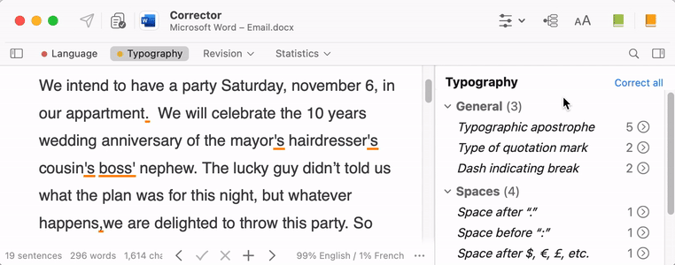
Typography detections
Typographical detections are displayed in the second view of the corrector, entitled Typography (1). They are listed in a panel on the right and grouped into three classes: General (2), Spaces (3) and Conventions (4). This third one groups detections related to the format of times, numbers, addresses, and other elements of administrative writing. For each type of detection, the number of occurrences appears to the right of the generic title. Click on the circled chevron on the right to see the relevant passages (5).
-
 12345
12345
Typographic detections are very consistent. The same spacing applies, for example, after all periods and commas in a text. The corrector opts for a generic presentation rather than a specific one. Thus, typographical detections in the same context are grouped under a single generic title, displayed in italics: Dash indicating break, Typographic apostrophe, etc.
Correcting everything in one go
Since typographical corrections do not really require deep thought, Antidote offers you the option of processing them in batches. Double-click on a generic title to fix the relevant subset or click Correct all above the list of detections to, you guessed it, correct all.

Antidote’s Typography Settings
Defining the settings
Go to Settings > Typography, where three panels contain around fifty customizable settings. It may seem like a lot, but it will only take you a few minutes to explore them and indicate your preferences. When you hover the mouse over the different parameters, tooltips appear to give you some explanations.

Otherwise, you can also indicate your preferences as you revise a text. In the tooltip linked to a detection, the word Setting following an explanation opens the appropriate panel for a targeted and quick modification.

To discover all the typographic settings and their nuances, see the section on this subject in the Antidote 11 User Guide.
Default settings
In each panel, a Recommended values button allows you to reset the default settings for your language variety. Indeed, the choice you made when you first opened Antidote to indicate your variety of English affects the default values of these settings. For example, in British standards, first-level quotes use single quotation marks and embedded quotes use double quotation marks. North American standards recommend the opposite!
- You can change your language region in Settings > Language > Author.
Antidote also offers four default presets, with different degrees of typographic detection:
- Maximum sensitivity: maximum value for all relevant settings, including typography.
- Formal usage: thorough correction of the language, and fine-grained verification based on the recommended typographic usage in your language variety.
- Informal usage: settings for a less rigorous correction, keeping only glaring discrepancies in typography (double space between two words, for example).
- Minimum sensitivity: minimum value of all relevant settings, including typography.
Creating several presets
One of the new features of Antidote 11, which Antidote Web inherits, allows you to create presets and apply them directly in the corrector.
They can be particularly useful for texts that have specific typographical needs, depending on the language variety of the recipients or the type of publication. For example, you can define a preset for social media, where thin and non-breaking spaces are not supported.
Or, if you’re a journalist, the publication you’re writing for may follow in-house typographical rules. (Also read our article on 12 Antidote Functions Every Journalist Should Know.)
To create a preset, adjust all the desired settings, then click on the Presets menu then on Save as.

You can also start from an existing preset, and modify only the necessary settings. Start by selecting a preset from the Presets menu, then change the settings as desired. When you are done with your changes, open the menu again and choose Save As. Then access the preset directly in the corrector from the settings menu ().
To find out how to modify or delete a preset, consult the User Guide.
The Rules of the Art
If typography is an art, you now have everything you need to create your masterpieces with Antidote’s features. But remember the bottom line: stick to the standards you have chosen. Typography is above all a matter of consistency. Fortunately, with the presets, you’re all set!